


Music is beautiful.
Just as an orchestra is more than boxes of wood and strings and brass, a brand is more than a logo, colors, and fonts. It is a symphony of elements that work together to create something familiar. Music moves us. We hope our brand can do the same.
This is our sheet music.
Logo
Basic Elements
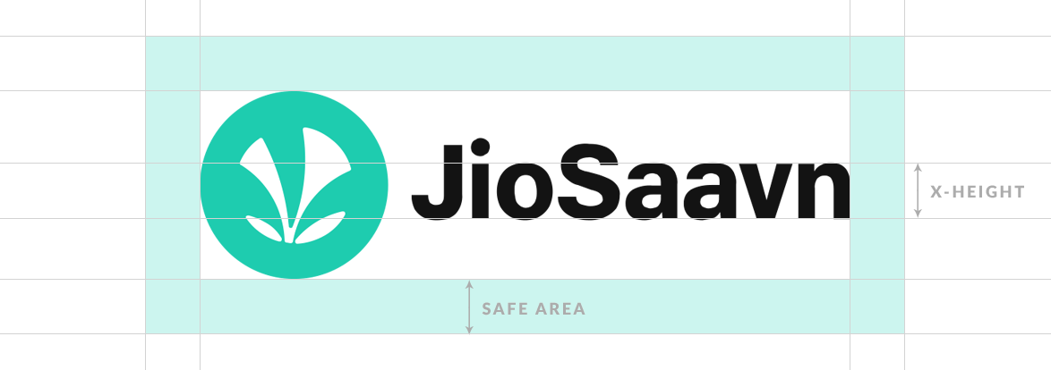
The JioSaavn logo is comprised of two parts: a logo mark and a word mark. They can appear together, in horizontal arrangement or the icon can appear on its own. There are two allowed colorways.
The word mark should never appear on its own.
Constructions
The horizontal logo includes both the logo and word marks, locked in a grid based on the word mark’s x-height (or specifically in this case, the height of the letter v in JioSaavn).
The logo mark should always have 1x the x-height around the outside as clearspace. When appearing with other elements, the left edge of the logo mark should be used for alignment, not the clearspace.
Colorways
There are 2 approved logo colorways. The logo should only be presented with the best possible background contrast, and with preferences from left to right below.
Color White
Logo
JioSaavn White
Background
JioSaavn Navy
Color Black
Logo
Jioaavn Black
Background
JioSaavn White
Improper Use
When using the JioSaavn logo, please abide by the guidelines at all times, don’t use any old versions of the logo or alter the logo in any way, and avoid all of the following. If you’re unsure of proper use, please ask.
The JioSaavn logo is a registered trademark of JioSaavn LLC. Please use it with respect.

No unapproved colors.

Don’t stretch or distort.

Don’t change the layout.

Don’t replace inline text.

Don’t add shadows.

Don’t use old versions.

Don’t rotate the logo.

Don’t use transparency.
Color
Use
The color of a creative sets its tone and mood. While the ethos of the brand should be fun, bright and bold, rather than setting a static usable palette, creatives should use color appropriate for its context.
Contextual Flexibility
Colors used should represent genre, style, and compatibility with other established palettes already present.


While the brand should adapt to its context, JioSaavn’s core brand should use the identity colors.
The core identity color system is deliberately limited. It focuses on conveying clarity and consistency.
Identity Color System
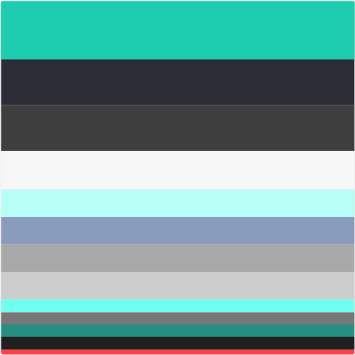
Primary
The four primary JioSaavn colors should be the foundation of any design, and used most regularly.
Secondary
Secondary colors should be used as accents to give detail in complex designs, layouts, and type hierarchies.
* Alert for use in UI only.
Don’t use in brand or communications.
Typography
Typefaces
JioSaavn has three main platforms with one primary typeface. Our mobile apps (Android and iOS), websites, and marketing materials use the Google webfont Lato, in multiple weights and styles in order to distinguish hierarchy within layouts.
JioSaavn has one display font that is used only as a graphic element in creatives, and shouldn't be used for contextual details.
Primary, Lato
Aa
Aa Bb Cc | 1234567890
ABCDEFGHIJKLMNOPQRSTUVWXYZ
abcdefghijklmnopqrstuvwxyz
Aa Bb Cc Dd Ee Ff Gg Hh Ii Jj Kk Ll Mm Nn Oo Pp Qq Rr Ss Tt Uu Vv Ww Xx Yy Zz | Download Lato
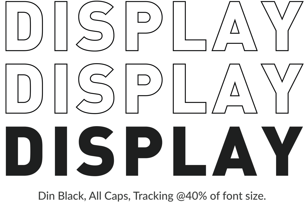
Display Only, DIN Bold
Basic Rules
There are a 4 simple rules to improve typography across any given platform. Follow these and the result will be a clean, neat, and generally well designed piece that fits within the Saavn brand.
Of course, rules are meant to be broken. These rules are only meant to be a starting point, and certain assets can and will fall slightly outside of their descriptions.
Hierarchy
Arguabaly the most important thing to be aware of when using typography is Hierarchy. The primary focus of any design should be clarity in communication – which is the primary role of Hierarchy. Think of Hierarchy as a visual order of importance. This can be achieved with either (or both) size and syling.
Look at your page and ask what you see first, then second, and so on. Does this Hierarchy make sense? Does a Hierarchy even exist?
In the example to the right, you can see the Hierarchy used on this page. There is a clear Hierarchy given to the typography with both size and style.
Blackbird singing in the dead of night.
Take these broken wings and learn to fly.
All your life – you were only waiting for this moment to arise. Blackbird singing in the dead of night. Take these sunken eyes and learn to see. All your life – you were only waiting for this moment to be free.
Sizing
While it is important to maintain a good Hierarchy, it is also important to maintain a sizing system that creates consistency.
No document, webpage, or asset should have more than 5 text sizes. This allows for enough variation to create a strong Hierarchy, without over complicating a layout, or impeding the ability to create a consistent sizing system.
This webpage, for example has only 4.
h1 - Heading
p - Paragraph
Label – Labels
caption - Captions
Accent or Emphasize
Utilizing a font's weights can help create emphasization of words or sentences without breaking your sizing system. Not only that, using accents and emphasis styles can help break up large areas of text.
This document, for example, uses Saavn Green for anchored links within the document, and uses an underline for links out of the document. It also uses bold italics for emphasizing important words or phrases, and uses a separate pullquote style for important content.
Leading & Kerning
Leading is the vertical space between lines of copy, and is important when working with a lot of body copy.
The smaller the text, the larger the leading should be in relation to the text size in order to increase legibility. For example – the text you’re reading is using 16pt text with 24pt leading (a 1: 1.5 ratio). In the Hierarchy example above, though, the large text is using 32pt text and only 40pt leading. Because that text is larger, and includes less lines, the leading can afford to be tighter.
Kerning is most important in headings or large title text. It is the space between each letter in a word. Fonts give each letter space around it, and sometimes, the lockup of two letters will look inconsistent with the rest of a word's kerning. It’s important to manually kern any large single or few word titles, especially in print.

Good Leading
There must be some kind of way outta here. Said the joker to the thief. There's too much confusion. I can't get no relief.

Bad Leading
Business men, they drink my wine. Plowman dig my earth. None were level on the mind. Nobody up at his word. Hey, hey.
Good Kerning

Bad Kerning

Verbal
Voice & Tone
Visuals can only take the Saavn brand so far. The verbal brand experience is weighted just as significantly as the visual. Saavn’s goal is to delight the user. Both visually and verbally.
The personality of any brand is determined in large part by two key components of the verbal experience: voice, and tone. The difference? Our voice stays the same – it’s our style and point of view – but our tone changes, and is specific to the messaging. Let’s face it, looks can only get you to about the third date, and we’re in it for the long haul.
Voice
What we talk about.
Our voice is human, smart, and fun, but – most importantly – clear. Rule of thumb: don’t sound like a computer. *Cough – I’m looking at you, engineers – cough*. That said, the priority is always to deliver the user the information they need to understand and use our products as they are meant to be used.
Tone
How we talk about it.
Our tone is generally informal and witty, but it’s important that the tone is determined by the message. Think of the user and their thoughts. Are they confused and looking for help? That’s probably not the time to be funny. Is the user excited to have become a Pro user? Are they learning something new? Once you know the emotional sate of a user, you can adjust your tone accordingly. If you’re not sure if it’s a good time to be funny, it’s probably not.
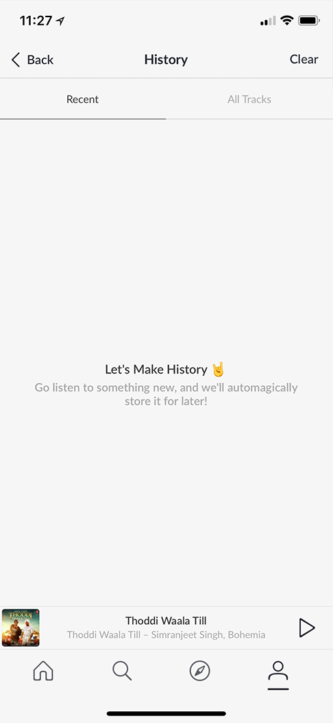
History Empty State
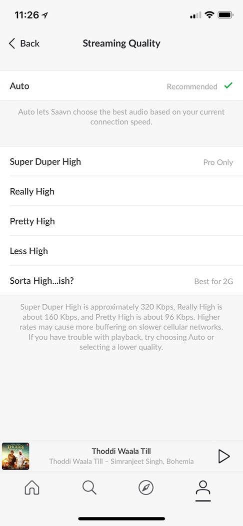
Streaming Quality Picker
Email Login
In all of the samples above, you can see that while our voice and tone are human and witty, we are also sure to be thorough and clear.
Branding
Overview
The JioSaavn Brand is built around a direct visualization of goosebumps. It is a modular system that is flexible and identifiable. At the core of the system is a wave element, and many others that stem from the same concept, as the most basic building block to our brand. It symbolizes anything from sound waves, to movement, to goosebumps.
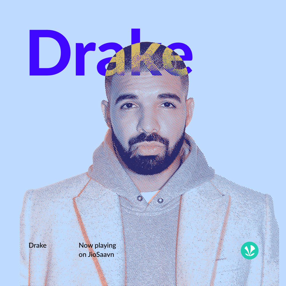

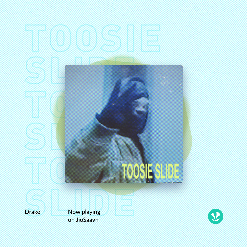
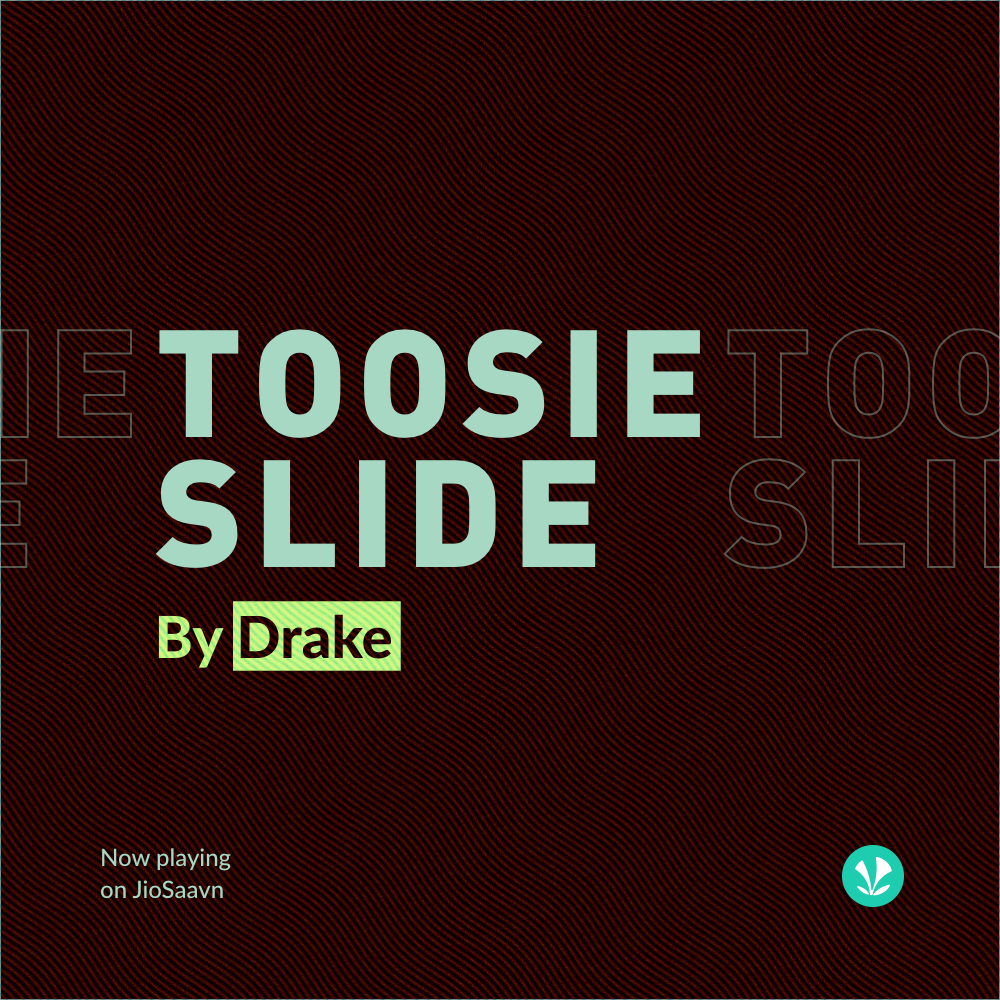
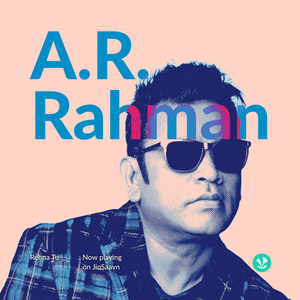
Photo Stylization
There are two main styles that should be used on photography within the JioSaavn brand.
These stylization techniques help define our brand and should be used among other branding elements to create visually appealing creatives.
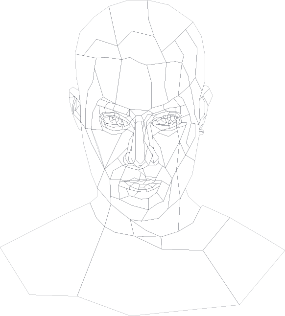
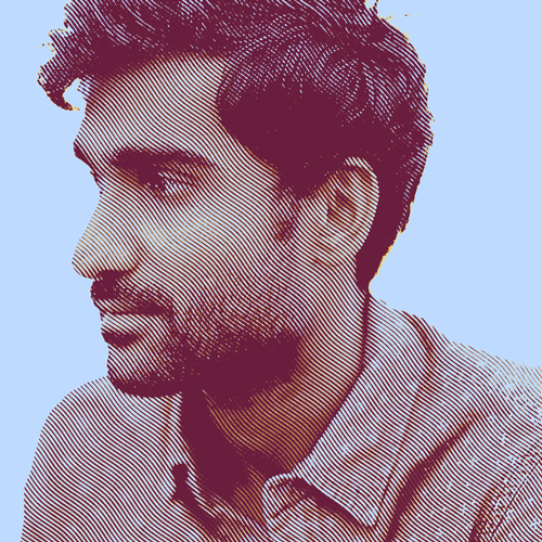
Polygon
Portraits
The process of creating a polygon starts with permission from the artist (or their label) and a well lit, (preferably) high res photo.
Creating the illustration is a result of many polygonal shapes (no curves) drawn so that each shape connects to the next. The result is a vector illustration that should strike an easily recognizable likeness to its' reference image.
Because they are vector, these can be used at any proportional size, and are great for print especially.
Nucleya Polygon
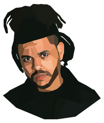
The Weeknd
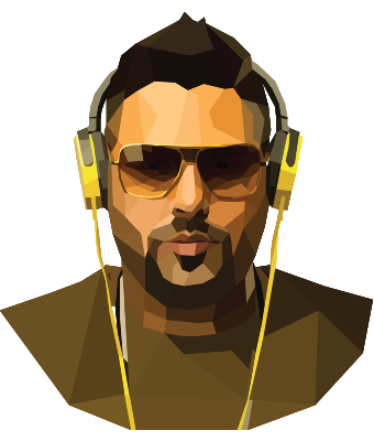
Badshah
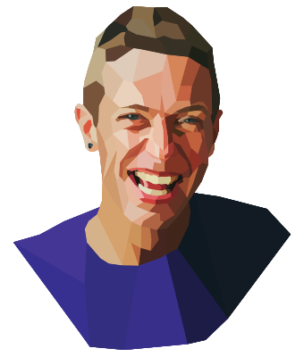
Chris Martin
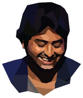
Arijit Singh
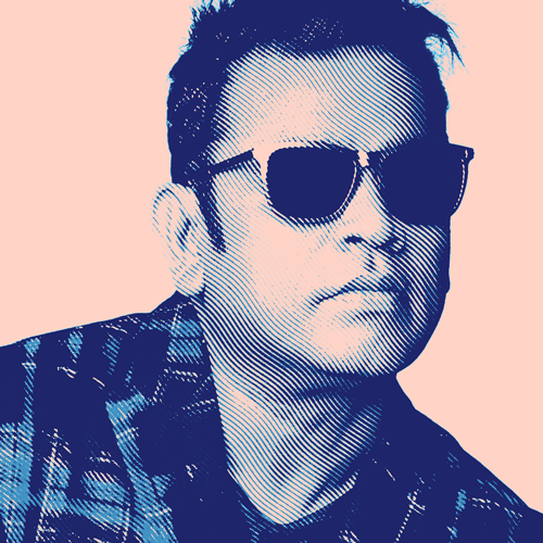
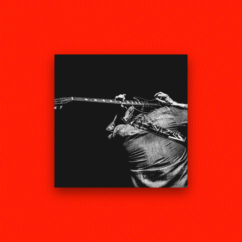
Motion Halftone
Portraits & Backgrounds
The motion halftone stylization should be used on full photos, cutout photos, or photo backgrounds, to bring interest and consistency to the brand and its' creatives.
The motion halftone effect uses a wave pattern as a halftone over an image, and uses color similar to the way albums used to be printed in halftone dots. It brings an element of visual interest to a photo, while incorporating a nostalgic purpose and familiarity.
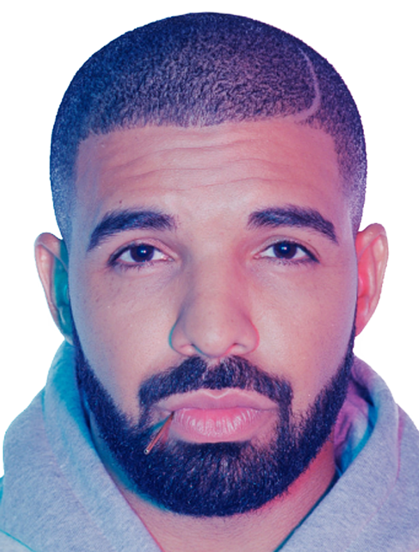
Drake Motion Halftone
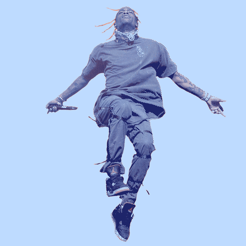
Travis Scott
A.R. Rahman
Prateek Kuhad
Elements
A collection of elements build the JioSaavn brand. Elements can be layered together or individually to bring interest and familiarity to creatives.
These elements should be used in JioSaavn creatives with consistency.
Waves
The waves element evokes movement, and can symbolize anything from sound waves to rhythm, to the goosebumps you get from a great song. When motion is applied, the waves create an illusion of movement.
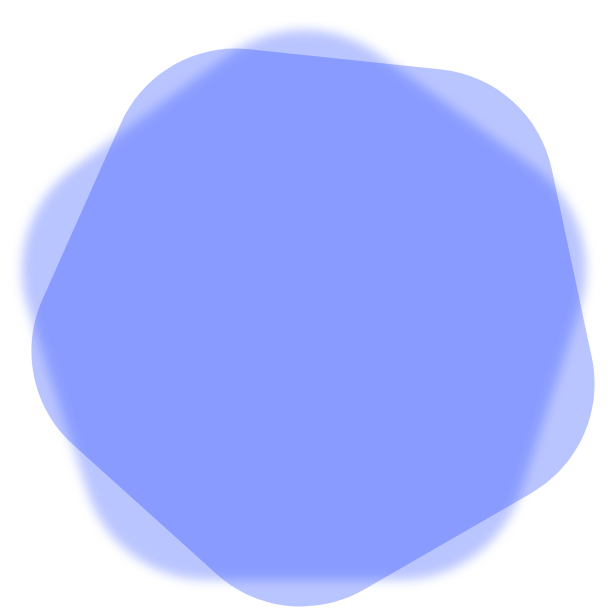
Blob
While visually underwhelming on its own, the blob is an invaluable piece of the brand. It should be used as a background element in creatives to create depth and as a way of highlighting the subject.
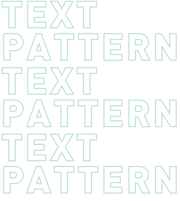
Text Pattern
The text pattern element can be used in more minimal designs to bring interest to the creative. Actual contextual information shouldn’t be used - this is only meant to be a visual element.
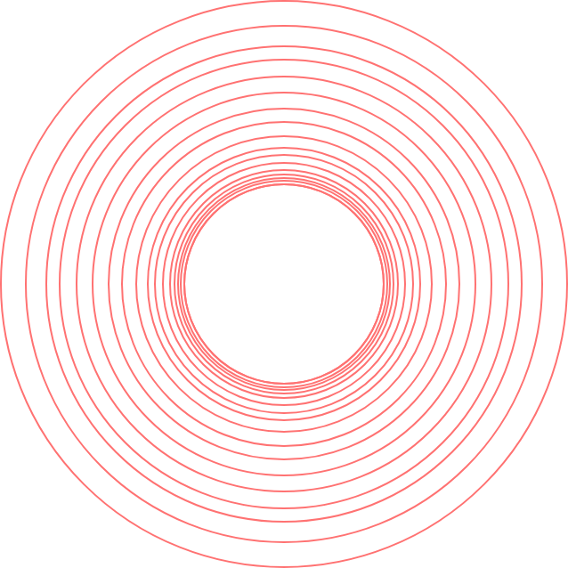
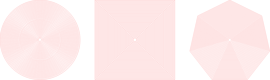
Ripple
The ripple element is meant to visualize movement, similar to the way waves of sound move in a rippled state through space. When motion is applied, the ripple creates an illusion of movement.
There are variations to the ripple element, including three shapes, with options for each.
Text Wave
A text wave element can be used in more minimal designs to bring interest to the creative. Actual contextual information shouldn’t be used - this is only meant to be a visual element.

Frame
The frame can be used in association with an image, and can include other overlapping elements to create dimension.
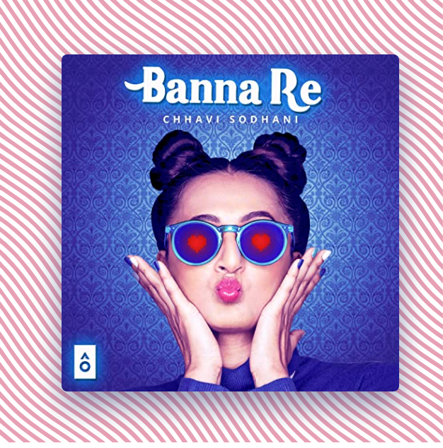
Album Art
Album art can be used as a foreground element in creatives. Colors used should be pulled from the album art. The album art shouldn’t have any effects or treatments added.
The Angle
3.5°
The JioSaavn angle should be used as a divider in any medium to bring contrast and interest to the space between two sections.
The JioSaavn Angle is a 3.5° top only angle. This means that the left and right sides of the container should still be at 90°, and the bottom should be at 0°.
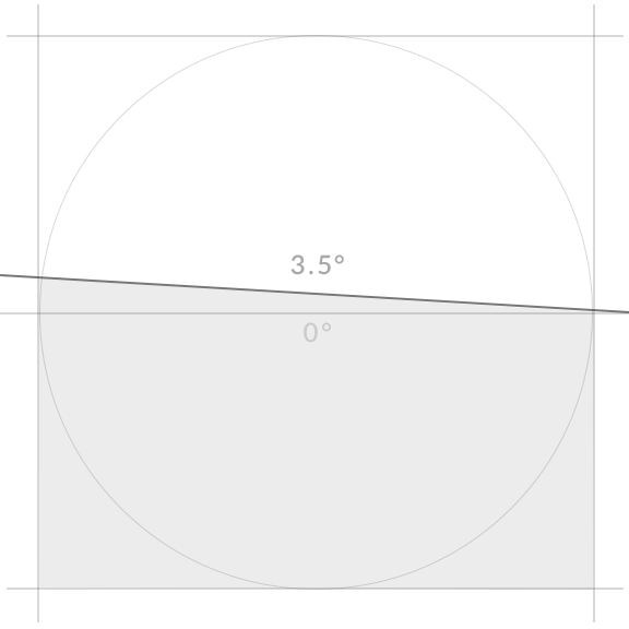
The JioSaavn Angle
Artist View
Channel View
Show View
Sub Verticals
There are two sub verticals within the JioSaavn brand that carry their own logos – JioSaavn Pro and JioSaavn for Brands. The guidelines, colorways, and safe area requirements for these two logos are the same as the primary logo.
JioSaavn Pro
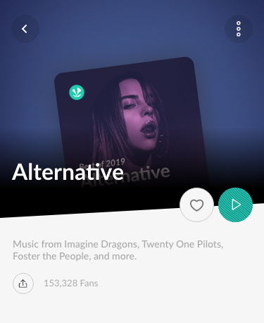
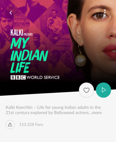
JioSaavn Pro is JioSaavn’s paid subscription model, offered in a number of different plans and pricing options that unlock some or all of a full suite of benefits not available to free users. These include ad-free music, unlimited downloads, unlimited JioTunes (where available), HQ audio, exclusive content, and more.
JioSaavn for Brands
JioSaavn for Brands connects advertisers with JioSaavn’s audience of streaming music and podcast listeners, allowing brands to be heard when the audience is actively listening. JioSaavn for Brands’ sophisticated ad experience suite consists of display, audio, video, and content solutions to get brands grooving with their target audience.
Brand Lockups
When JioSaavn is in partnership with an external brand, the two logos are locked with the space between being equal to the width of the JioSaavn icon. A hairline the height of the JioSaavn icon is placed at half the icon’s width (or directly centered between the two logos). The safe area surrounding the entire lockup remains 1x the height of the letter v in JioSaavn.
These guidelines apply to the primary JioSaavn logo, as well as each of the sub vertical logos.
Resources
Download Assets
Download the full JioSaavn Logo pack, or visit our complete resources page after you have read all brand and trademark guidelines. If there are any questions or confusion, please contact us immediately for clarification.
Jump to the logo section to read and comply with all brand and trademark guidelines.
I have read, and agree to abide by, all of the brand guidelines.